Visualize Terrorism
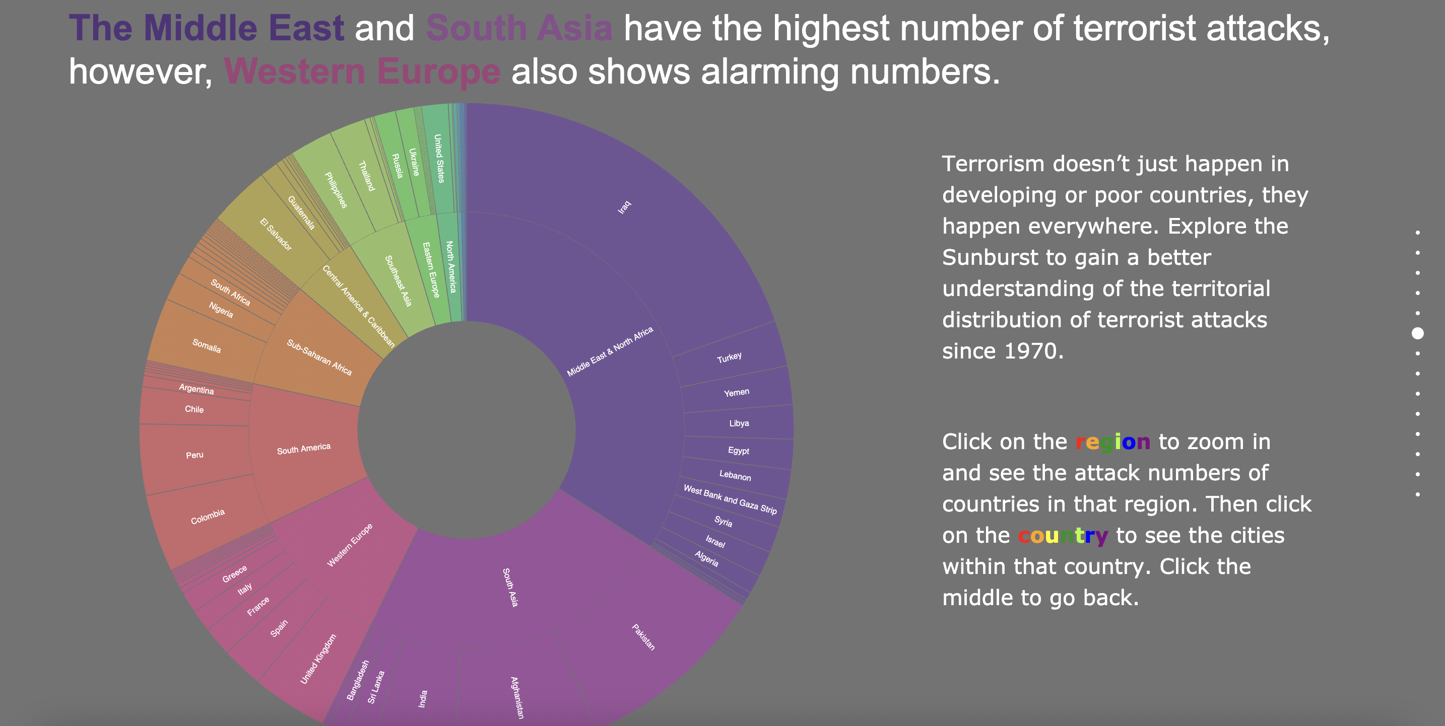
As four international students, we are interested in gaining a better understanding of one of the most important and difficult issues in the world: terrorism. As we have seen in the media in recent years, the rise of terrorism and violence has impacted people around the world. Terrorism implies the use of violence to terrorize a population or government for certain political, religious or ideological purposes. The threat of terrorism has become a worldwide concern with several parts of the world reeling under frequent terrorist strikes. To shine a light on this issue - hoping to bring further awareness and help - we decided to tackle the following questions through visualizations:
Is our world becoming more chaotic or peaceful?
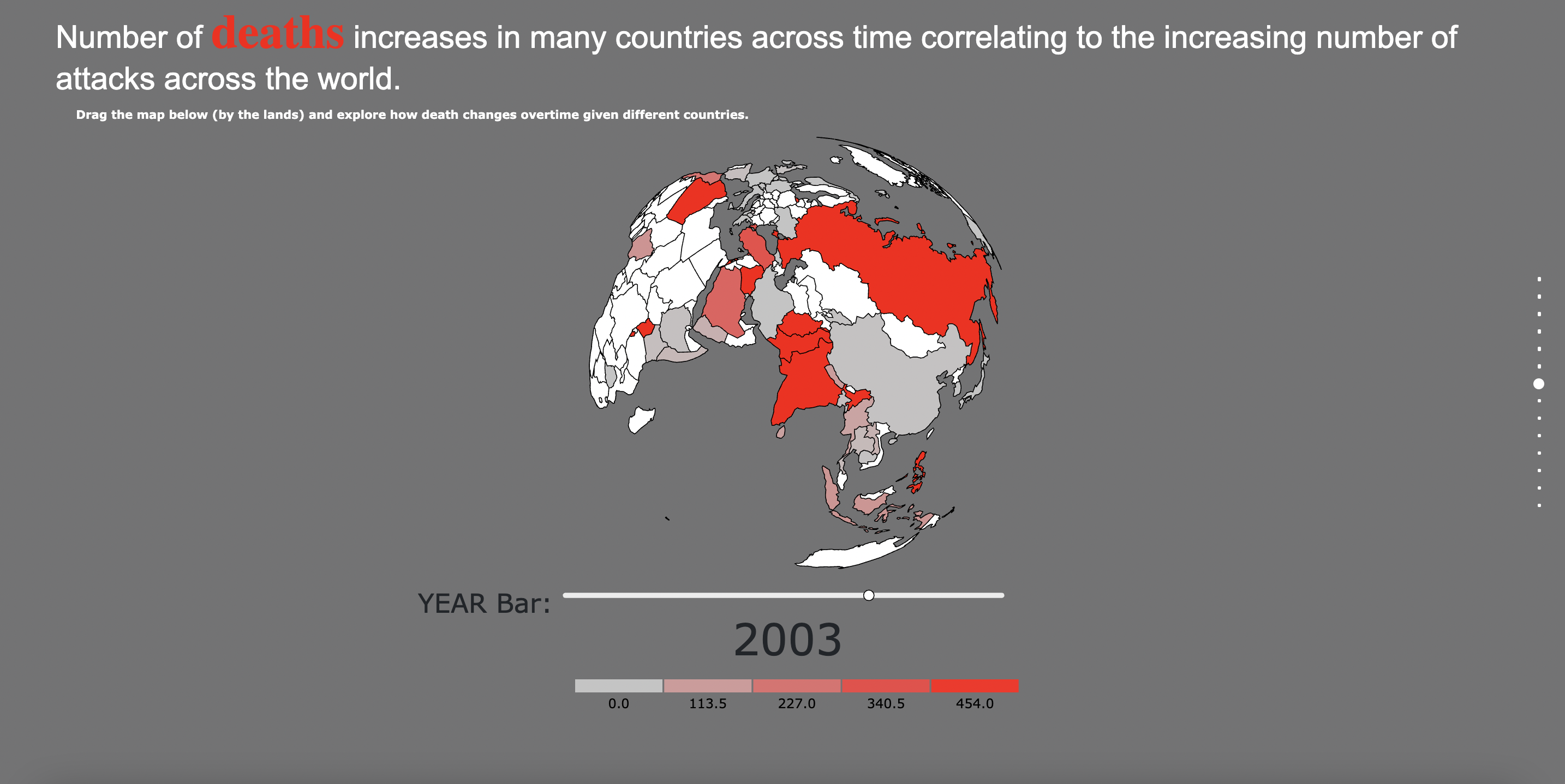
How many people died across the years in different parts of the world due to terrorism?
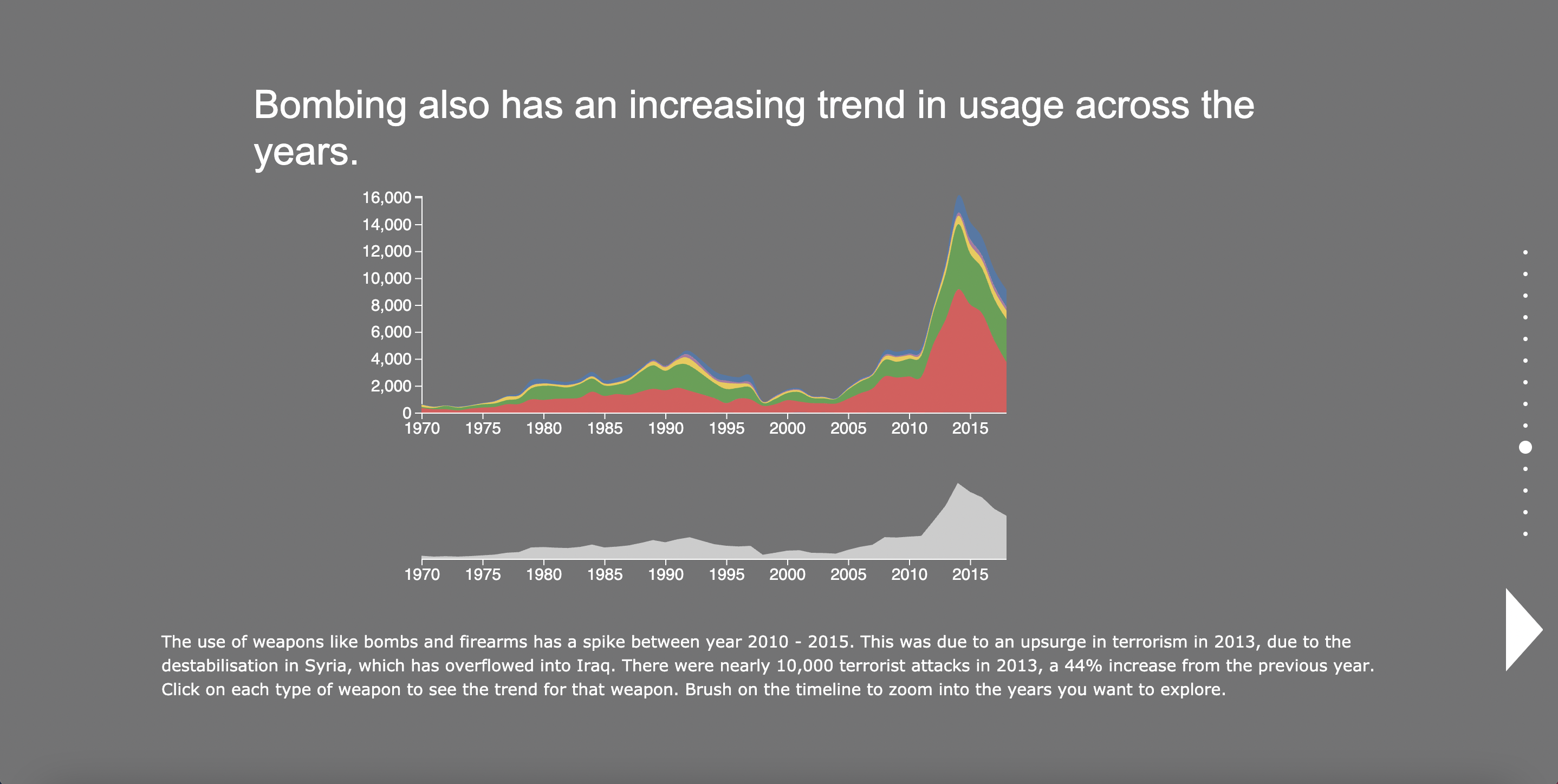
From 1970 to 2018, did the number of deaths due to terrorist attacks increase across the years?
What are the most common weapons used in terrorist attacks?
Who are the main targets of the attacks?
What are the most notorious terrorist groups in history?
What does the influence of these groups change throughout time?
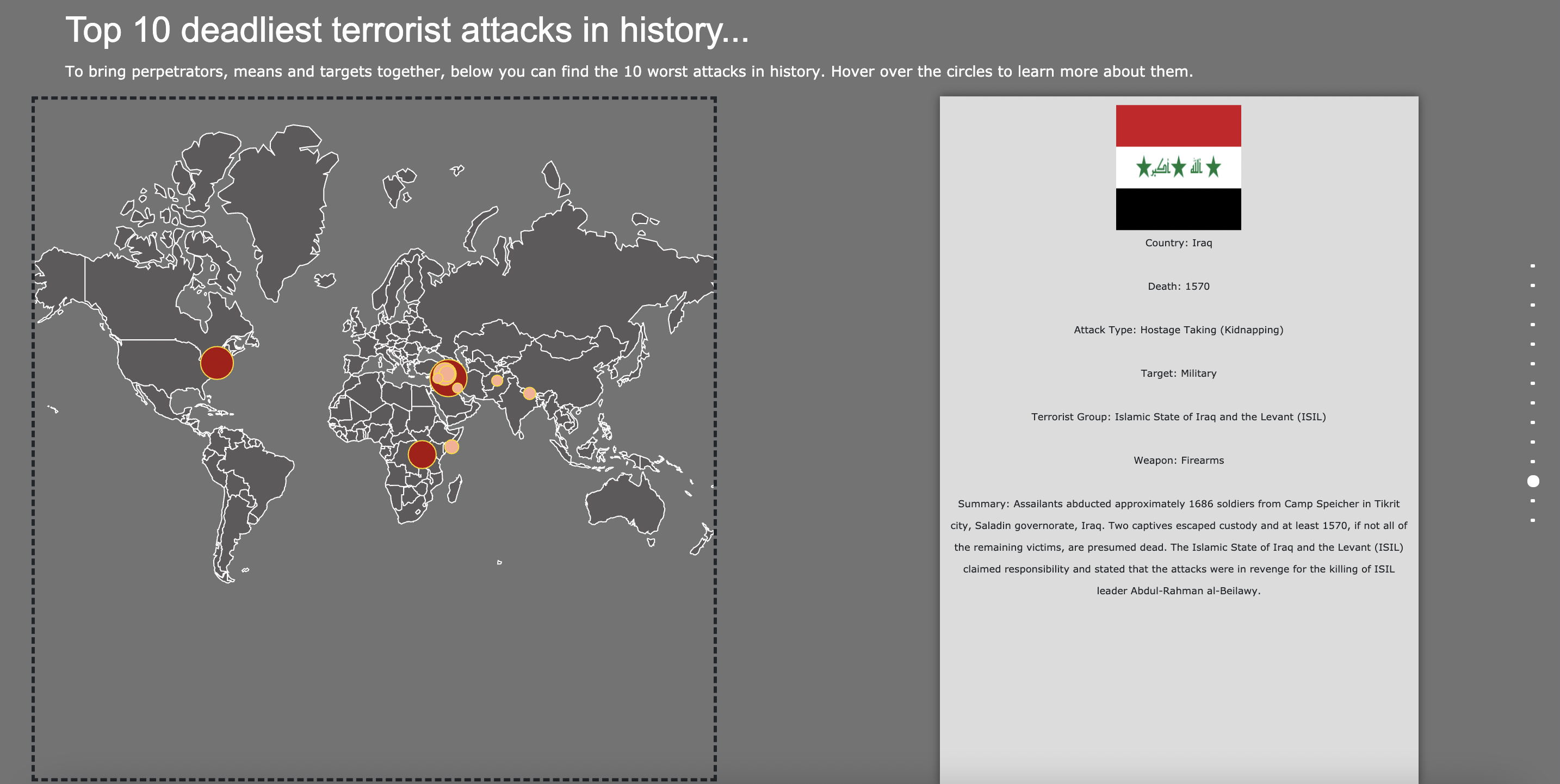
What are the 10 worst attacks in history?
New York Airbnb Project
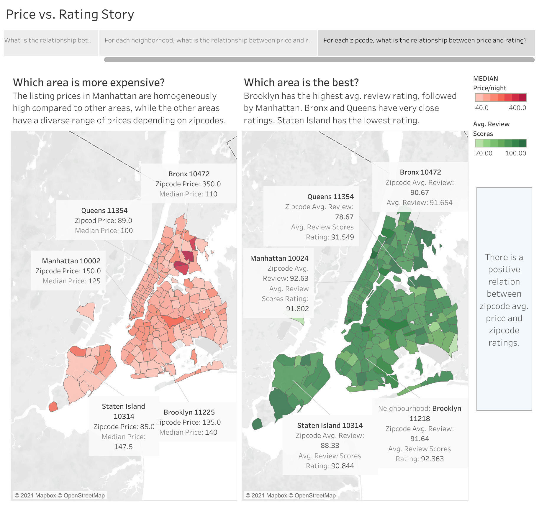
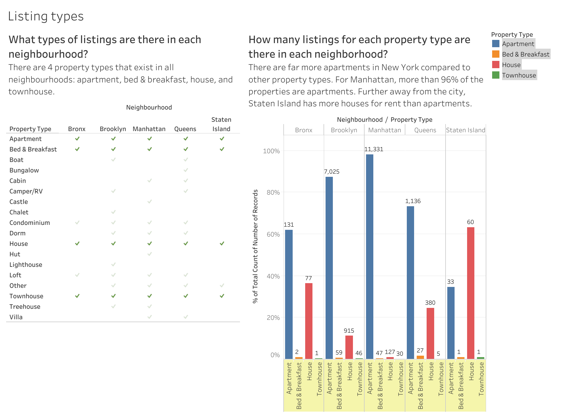
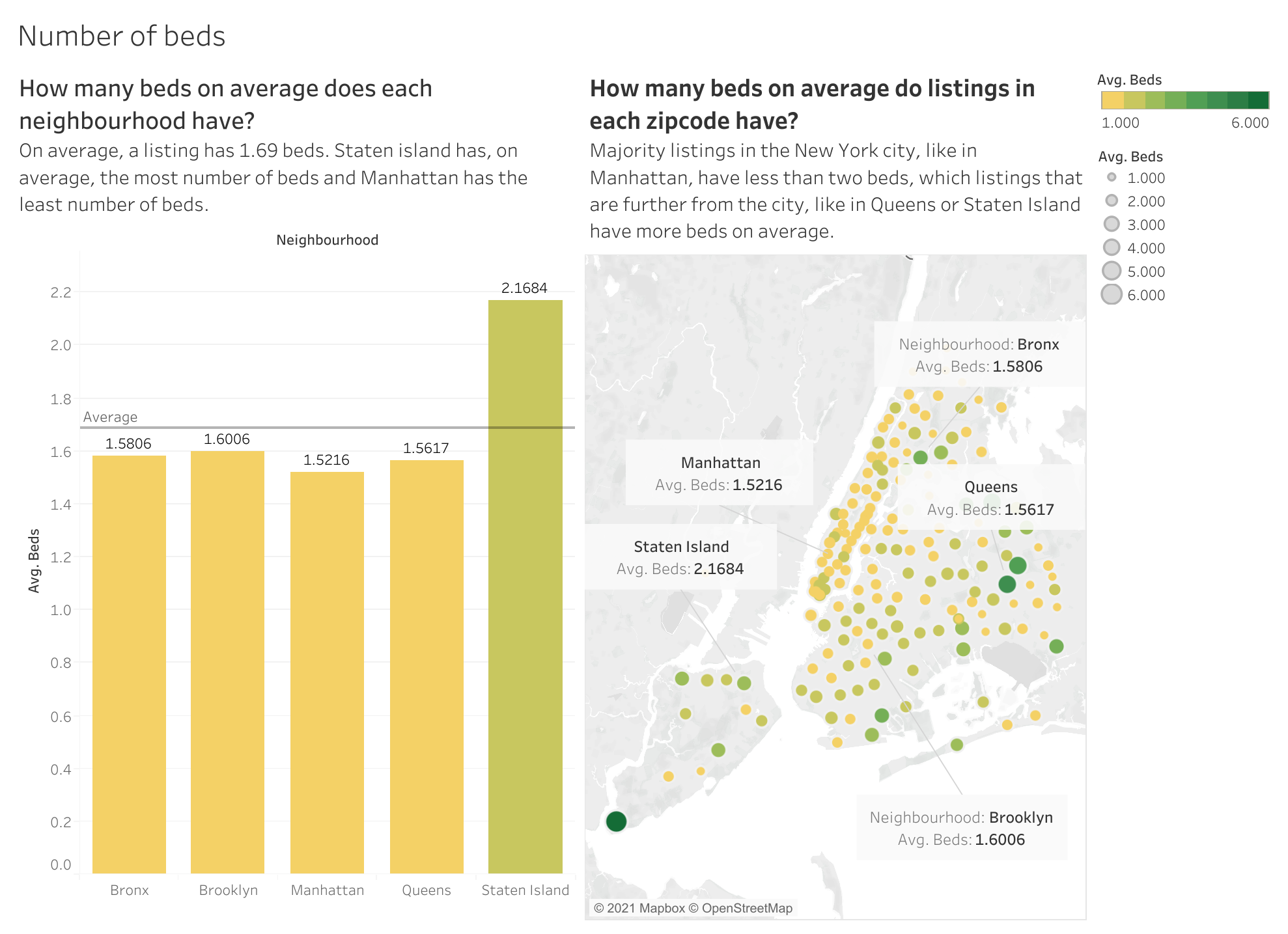
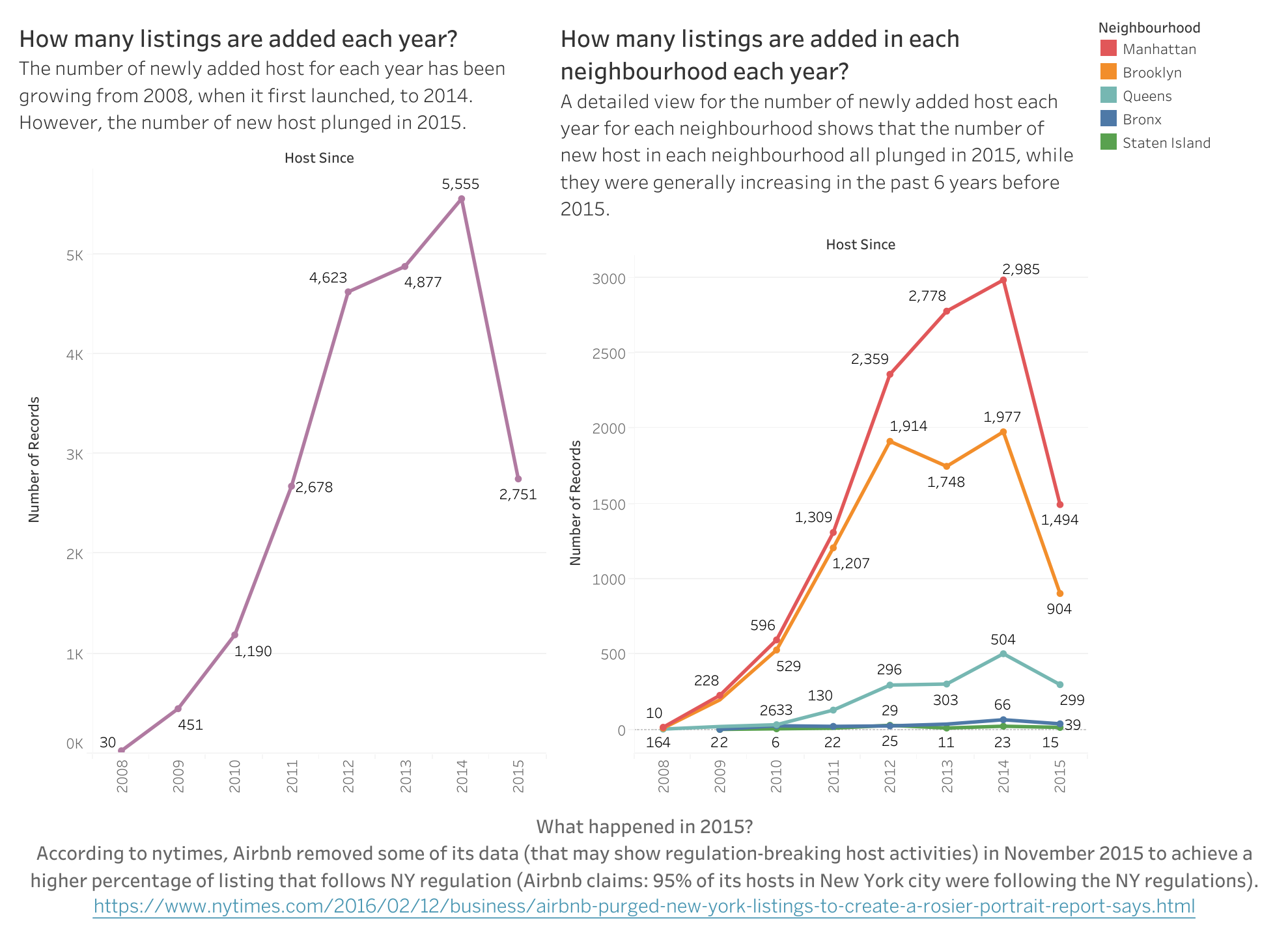
In this project, I utilized Tableau to create insights into the New York Airbnb dataset. In order to gain a better understanding of the data, I created dashboards and story points with annotations and highlights to explore the following topics: number of beds in neighborhood, types of listings and rooms, price vs. review, and listing growth across the years.
Visualization Analysis
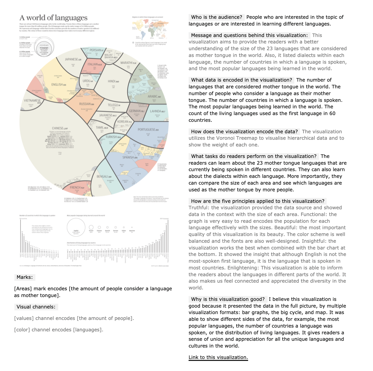
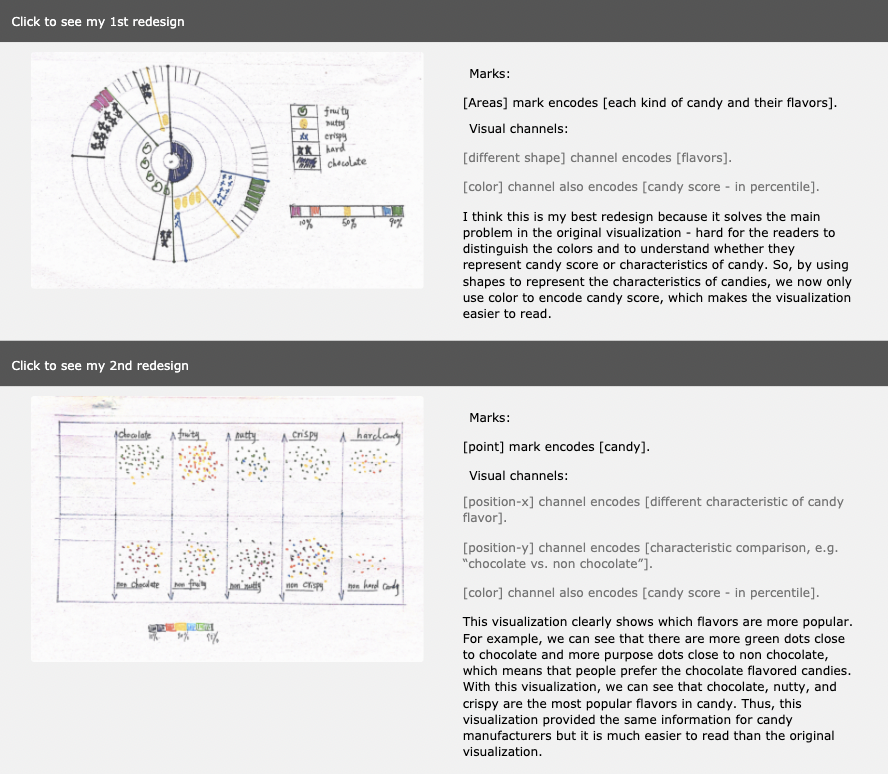
In this project, I provided analysis and critique on existing visualizations, and created redesigns of the visualizations.
Mini Projects
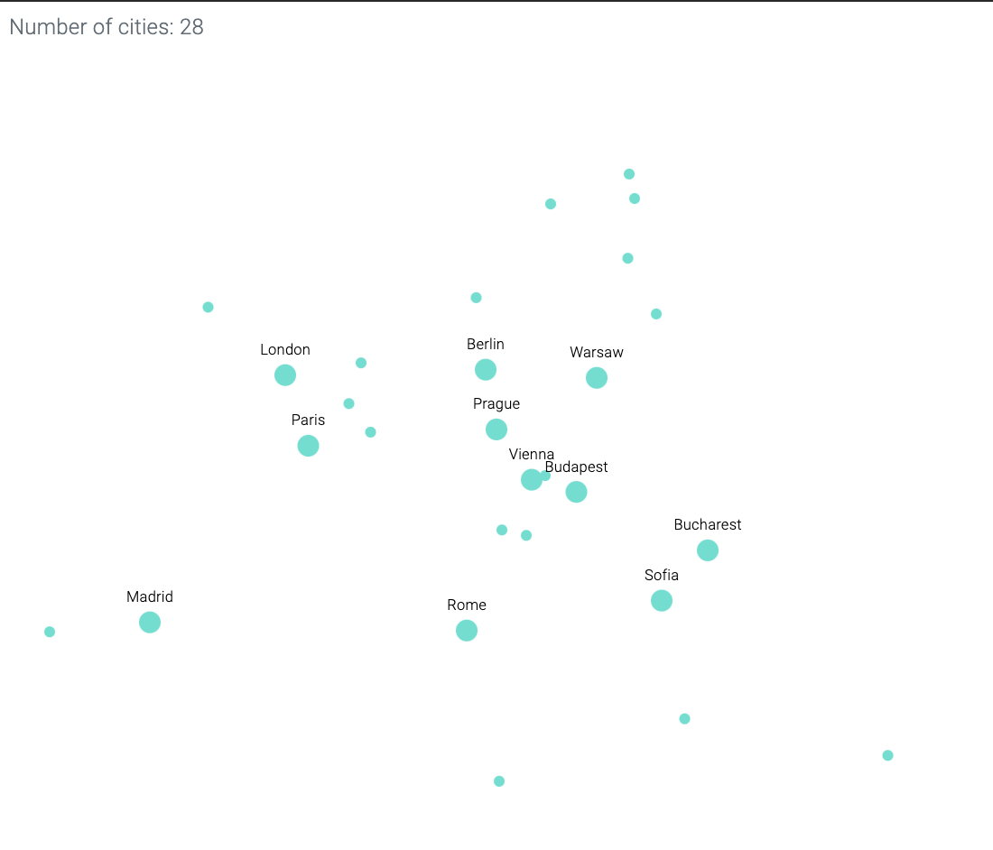
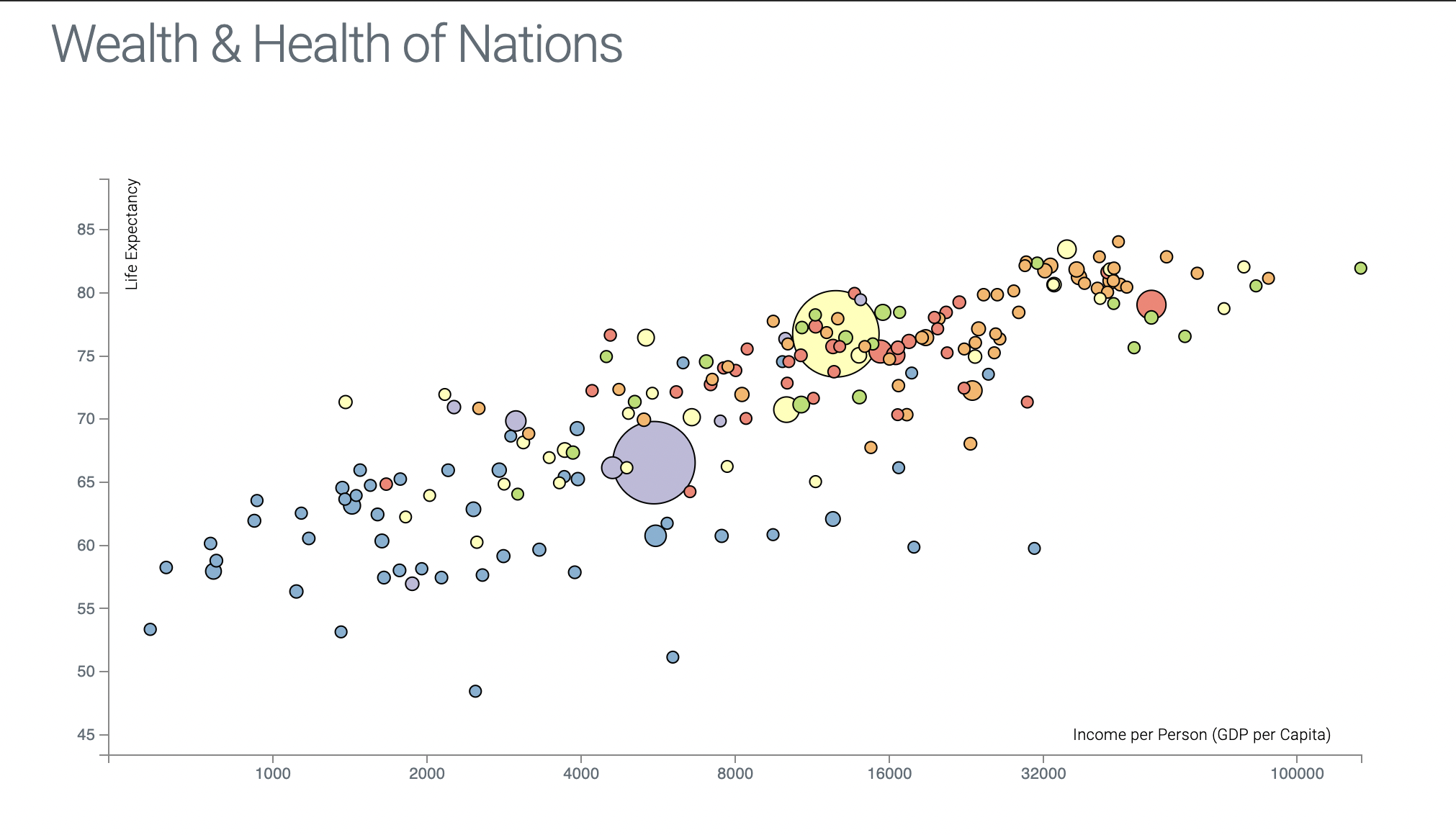
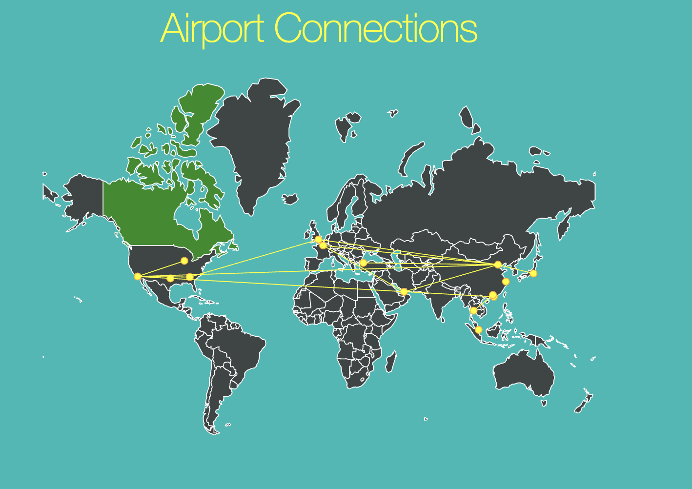
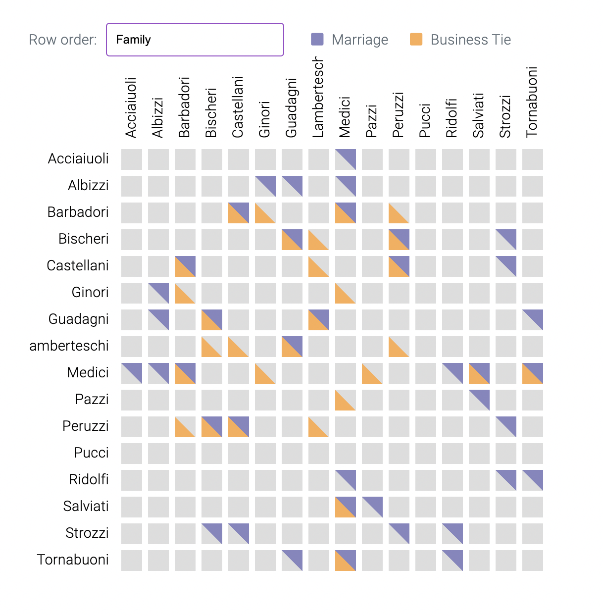
For my visualization course, I created a number of interactive visualizations primarily using d3.js. These labs were designed for us to practice our technical skills and fluency in d3, so each lab focuses on certain techniques and capabilites of d3 such as scales and axes, update pattern, brush and zoom, animated transitions, and maps.